Townscape
Graphics:
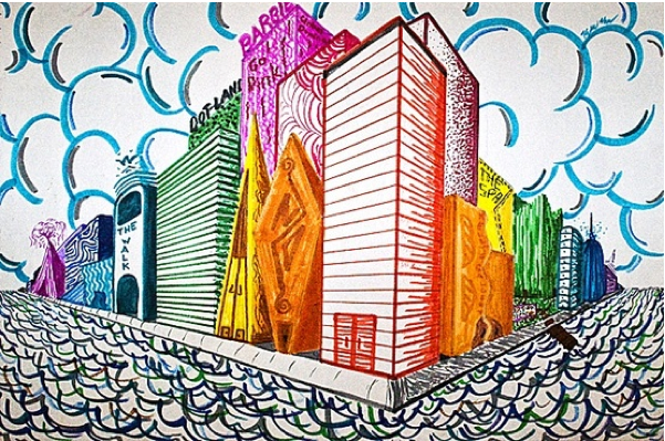
This is my finished Townscape drawing using Adobe Illustrator:

This is my Drawing With the template layer on.

This is my Drawing with the template layer off.
Graphics:
This is my Adobe Illustrator Drawing so far:

Graphics:
This week in graphics I have been making patterns:
I made a square and drew some shapes inside then I selected all the shapes and clicked object, pattern, make you can change the shape, size and colour then click done and drag your pattern to the swatch board for future color. And use the pattern in future shapes.


Townscape Evaluation:
Graphics Evaluation:
My finished townscape drawing using adobe illustrator looks good i have incorporated different shapes both geometric and organic i have used the pattern and layering tools, and also added colour to the shapes using colour and gradient.
I think my finished drawing looks good if i did it again or had more time i would think more about the colours and try to get the more contrasting colours instead of putting colours together that don't match.
I really like the drawing without the template layer underneath just the drawing not the picture I think it looks really good and you can still tell what the picture is, it kind of has a cartoon - like feel.
Photography:
I have looked at various artists such as Paul Strand , Harry Callaghan and Alvin Coburn i liked Harry Callaghan for his double exposure shot with the car coming through the wall I think that is a really inspiring piece i really like it.
The Part I liked the most in photography is where we edited the pictures of the computer and also taking the pictures in the first place.
The worst part of the Photography was the written excercises because I would have liked to have done more practical work.
I think with more time I could have taken some better townscape shots so I could have had better materials to work with.
Textiles:
In textiles we had to make a body supported structure for townscape, so I looked at some artists who had incorparated architecture in their fashion work such as Issey Miake or Hussain Chaylan.
I designed my body supported structure off the flame towers in dubai.,
I really enjoyed this particular excercise.
Visual Studies:
In visual Studies we have been doing various drawings, paintings and collages.
I like the painting of the church i did the most.
I have also researched townscape artists and John Hammonds work of the Acqua Della Luce in Italy was great for its in depth paint quality and great attention to detail.
3D:
In 3D I have made a sculpture based on the flame towers in dubai this is to keep some consistancy in my work then I have a similar theme throughout my project folder/book. I have researched various artists such as Su blackwell , Jen Stark and Maurizio Savini. I particularly like Jen Starks Work for the 3D Paper Sculpting that she does I love the colour that she uses.
Printmaking:
-Monoprinting:
I haven't enjoyed this particular type of printmaking because it think it is a really strange way to do printmaking and the print come out backwards so that also itsn't a plus point but i like the effect that it has.
I looed at some printmaking artists such as frances Alford, Carole Kirk and Natasha Gompert.
Who I all like their Work.
3D Sculpture:
3D Sculpture:
I have started my sculpture and i have covered the frame i created in modroc.
I made the frame using wood and copper wire to get the shape, then glued the twisted shape.
Here are some pictures:
Here are some pictures:

This is my frame for my structure it is untwisted
at th moment i plan to glue the metal rod in th middle the the wood while it is twisted to get the twisted structure i need.

This is my twisted structure i can now cover my structure using paper mache.
I have decided not to use paper mache becuase the consistancy of the paper wouldn't be right, so i have decided to use modroc for the texture and it would have taken to long to dry and have a thick enough layer to make the structure stable and sturdy.


My modroc structure has gone a little orange at the edges becuase of the copper wire underneath when it was wet, so i am trying to decide whether or not to paint it.
I would have liked to have had more time on my creatting the piece rather than in the planning stages because if i would have had more time my plan would have been to get some photographs printed out of my structure and add colour to them to see what the strucutre would have looked like then i could have maybe added a little colour to my structure.
Textiles:
In textiles it was my last week in textiles to finnish my body supported structure.
Here is my finished piece:

Graphics:
In graphics we have been using different tools and selections to get used to using Adobe Illustrater.
 I have picked the free distort tool to make a long rectangle for my brickwork on my townscape graphics work.
Visual Studies:
In graphics we have been using different tools and selections to get used to using Adobe Illustrater.

 |
| I created a square using the shape tool. |
 |
| I changed the shape of the square. Using the free distort tool. |
 |
| This is the free distort button. |
 |
| I clicked expand appearance. |
 |
| This is the expand appearance button. |
Visual Studies:
We have been doing painting of the blackburn townscape this is my unfinnished outcome:

Graphics:
In graphics we have been using Adobe Illustrator to use shapes to draw we used a photograph from our townscape photography. We have been using the draw tool and the blob tool whilst doing this drawing.

This is my Outcome so far:

Textiles:
3D Body Supported Structure:
In Textiles we have had to create a 3D Body supported Structure.
I have thought of making the Dubai towers as Part of my 3D textiles Project.


 I have decided to use the felting method to create the shape and design i have chosen.
 |


I don't think this is the best body supported structure because it covers the face so as a fashion piece not soo good but based on townscape i think it is a really good piece especailly the comparison between the fashion piece and the builidng on the left.


These are good archetextural pieces of fashion.
3D Structure:
In 3D we have been asked to create a 3D townscape structure
I have decided to use the same theme as my textiles because I like the structure and the way the building looks.these are the Dubai Towers.Townscape Research:
 John Virtue was born in 1947 in Accrington and became an English artist who specialised in monochrome landscapes. He also worked as a postman before becoming a full time artist with a studio in Exeter.
 |
| I like this building for it's silhouetted buildings. |
 |
| I dont like this because i dont think the picture is detailed enough |
I like how the light makes that one building stand out .
 |
| I love this picture because it combines townscape with landscape . |

Lucy Pratt
Thames by nights
I love this Textured effect in this
Townscape Painting and the Paint quality
of the water and the reflections
of the townscape in the thames.

Acqua Della Luce
Venice, Italy
I really like the paint quality of the water in this image.
 William Lee Hankey
Sitting under the tree
I really likr this painting for its quality and texture the painting looks very textured.

David Bomberg
Jerusalem , Looking to Mount Scopus
1925, Oil Paint on canvas
I like the Painting for its clear imagery, i like the painting becuase it has light colours and great tone.

St Paul's and river
1945 ,charcoal on paper
I think this is a really simple piece of work but you can see what it is which i really like.
Double Exposure Photography Pictures:

It looks good and has kind of like and eerie effect.


I really like this close up of the flowers and it shows depth of field becuase of the background.

I like this photograph because I have taken two photographs one with the train coming through the bridge and one without.
3D Artist research / 2 Point Perspective Research:
Annotations in sketch book.
 |
| Su Blackwell |
 |
| Jen Stark |
These are 3D paper sculpture and other 3D work.
 |
| Jen Stark |
 |
| Jen Stark |


2 Point Perspective:
In 3D we have been learning about 2 Point Perspective and advancing our further knowledge from school. Here are my Perspective Drawings:


MonoPrint Research:


Visual Studies:
In Visual Studies we have been using different media to draw the townscape of blackburn.
Here are my drawings:

 these Drawings
we done overlooking the blackburn townscape using a 2B pencil.
 this drawing was created using ink and a brush to draw the blackburn townscape.
this drawing was created using a Red Handwriting Biro and a water brush. To create a Watered effect.
Photography:
We went out around our local town of blackburn to get some townscape pictures these are my best ones.
 |
| i think this one is the best photograph because of the way the light cuts the church in two surrounded by trees and nature the dark trees give this picture an eerie effect. |
 |
| I also like this photo for its ligh and darrk areas |
 |
| i love the way i have managed to capture the townscape of blackburn in this simple but elegant photo. |
 |
| i like this simplistic photograph |
 I love the way i have managed to get both old and new builings together in the same picture, i also like the way the light is working its way down the buildings side.
Photography:
We have been using photoshop to stitch photographs here are my results.
 i took the pictures from different angles to practice stitching.
have stitched together several pictures to get a panoramic shot, of this building i could make it better by having the lines lined up but i like the staggered effect.
Photography:
- Graphics:
In photography we had to get used to layering photographs in adobe photoshop here are some of the outcomes:


 Here i have had an attempt at layering two different images, he Eiffel Tower and Blackpool Pleasure Beach.
 Here i have tried to layer three images and changed the effect to a neon glow and the opacity so it shows all three layers through. Out of the Five This is one of my favourate ones.
I have chosen a New York Theme so i have tried to Layer three Different pictures from different times in places in New York so creat an image. The three images are: The Brooklyn Bridge , The New York Skyline, and a Snowy Central Park. This is also one of my favourate two.

Photography Research:
In photography we have started a topic called townscape and we had to do some research on photographers and double exposure photographers.

 these are my 4 best Photographs from my research.


No comments:
Post a Comment